Now that we understand Python, NumPy, and Pandas, allowing us to arrange the rows and columns of our tables in just the right order, we need to make sense of the data. The best way to do this is through visual exploration. I’ll cover the tool we’re going to use to create graphs in Python with some sample code, and then we’ll graph the S&P 500 using data from the St. Louis Fed.
Visualizing Data Using Matplotlib
Matplotlib is a 2D plotting library for Python. It is imported using the following convention:
import matplotlib.pyplot as pltIf you’re using Jupyter Notebook, you can add the following magic to display the plots inline:
%matplotlib inlineA matplotlib image contains two primary components:
- matplotlib.figure is the canvas on which a graph or multiple graphs are placed. It’s the container for all other elements.
- matplotlib.axes.Axes is the graph. It’s made up of an x-axis and y-axis, collectively known as axes, in which one or more plots are placed.
Below is a figure with multiple axes containing subplots. Comparing the code with the below image helps bring the two together.
# import matplotlib so we can use it
import matplotlib.pyplot as plt

# Create the figure container element that contains all other elements
width = 10
height = 15
fig = plt.figure(figsize=(width,height))

# Add axes to the figure with first argument being rows,columns, and then position, which starts from left to right then down
# Our example has 3 rows, 2 columns, and 5 axes skipping the bottom left, or 5th position
ax1 = fig.add_subplot(3,2,1)
ax2 = fig.add_subplot(3,2,2)
ax3 = fig.add_subplot(3,2,3)
ax4 = fig.add_subplot(3,2,4)
ax5 = fig.add_subplot(3,2,6)

# Define two lists for the x and y values to graph
x_values = [1,2,3,4,5]
y_values = [0,5,10,15,20]

# Add plots, legends, titles, etc. to the axes returned above
ax1.plot(x_values, y_values, color='red', label='plot 1')
ax1.plot(y_values, x_values, color='blue', label='plot 2')
ax1.legend(loc='upper left')
ax1.set_title("Title for Axes 1")
ax1.set_xlabel("Axes 1  X-Label")
ax1.set_ylabel("Axes 1 Y-Label")
ax2.plot(x_values, y_values, color='orange', label='plot 1')
ax2.legend(loc='upper right')
ax2.set_title("Title for Axes 2")
ax3.plot(x_values, y_values, color='green', label='plot 1')
ax3.legend(loc='upper left')
ax4.plot(x_values, y_values, color='blue', label='plot 1')
ax5.plot(x_values, y_values, color='violet', label='plot 1')
ax5.legend(loc='upper right')

# Add a title to the figure and then show the plot
fig.suptitle("This is a Figure Title")
plt.show()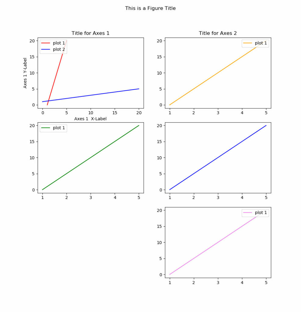
If you want to follow along, download the S&P 500 price data from the federal reserve economic data (FRED) from the St. Louis Fed. I’ve removed market holidays and non-number values while importing the CSV file.
# import pandas, numpy, and  pyplot so we can use them
import pandas as pd
import numpy as np
import matplotlib.pyplot as plt

# import the data and convert values to float, convert date column to datetime and set it to the index, and use only latest 10 values
data = pd.read_csv('SP500.csv', dtype={'SP500': np.float64}, na_values=".", parse_dates=True).dropna()
data['DATE'] = pd.to_datetime(data['DATE'])
data.set_index('DATE', inplace=True)

# plot the data and set the yticks to decensing by using a step of -1 (::-1 is start/stop/step)
plt.plot(data.index, data['SP500'])
plt.xlabel("Year")
plt.xticks(rotation=90)
plt.ylabel("S&P 500 Price")
yticks = data['SP500']
plt.yticks(yticks)
plt.title("S&P 500 Price History")
plt.show()
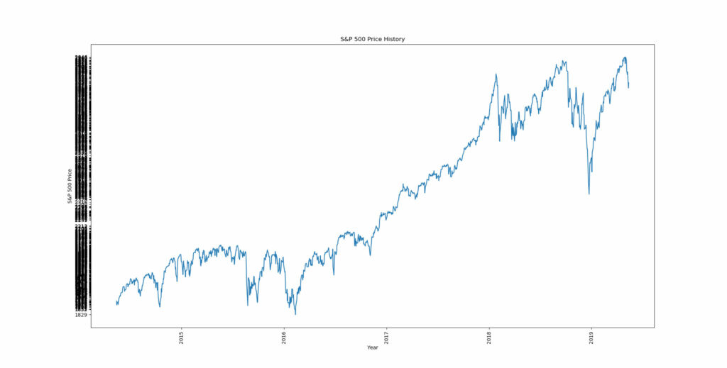
The year is spaced correctly, but how do we resolve the yticks? Using np.linspace will allow us to evenly space the yticks to our desired frequency.
# Import the data again
data = pd.read_csv('SP500.csv', dtype={'SP500': np.float64}, na_values=".").dropna()
data['DATE'] = pd.to_datetime(data['DATE'])
data.set_index('DATE', inplace=True)

# plot the data and set the yticks to decensing by using a step of -1 (::-1 is start/stop/step)
plt.plot(data.index, data['SP500'])
plt.xlabel("Year")
plt.xticks(rotation=90)
plt.ylabel("S&P 500 Price")
yticks = np.linspace(data['SP500'].min(), data['SP500'].max(), 10)
plt.yticks(yticks)
plt.title("S&P 500 Price History")
plt.show()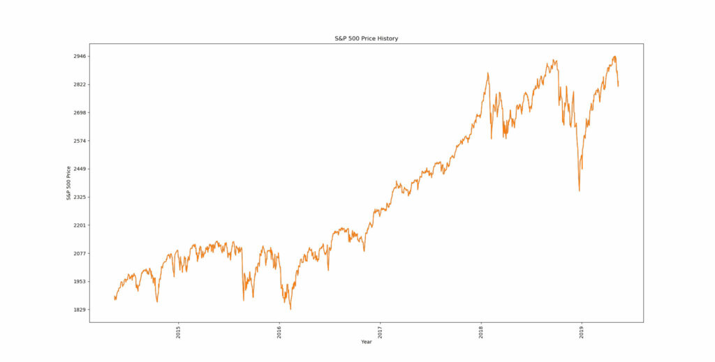
Common Functions and Methods
- matplotlib.figure.Figure.add_subplot adds axes to the figure and returns it for plotting
- matplotlib.pyplot.plot plots lines or markets using x and y-coordinate pairs.
- numpy.linspace returns evenly spaced numbers of a specified interval. Often used to evenly space axis ticks.
To be continued…