A tick chart draws a new bar after a set number of trades. A time-based chart creates a new bar after every period, such as one hour. Tick charts offer many benefits over time-based charts for higher-frequency traders.
This post will talk about what ticks are, how tick levels vary from country to country and compare tick charts to time charts.
What is a Tick?
We’ll start with a deeper dive into the definition of a tick.
A tick is the smallest unit of measurement for the price of an asset. The term can also describe the change in the price of a security from one trade to the next, but we’ll get into this second definition later in this post right before discussing charts.
Ticks are the smallest increments by which an asset’s price moves measured in the market’s local currency.
On many exchanges, including most European exchanges and the Tokyo Stock Exchange, the tick size varies depending on the stock’s share price.
For example, if the share price is between 3,005 yen and 5,000 yen, the tick size is 5 yen, but if the share price is between 5,010,00 and 30,000 yen, the tick size is 10,000. The London Stock Exchange uses an even more complex method for calculating tick size, which considers its price and share type.
On U.S. exchanges, the tick size is more consistent. Since 2001, the tick size for any stock with a value above one dollar is one cent, regardless of its size or type. Before 2001, the tick size for stocks on U.S. exchanges was one-sixteenth of a dollar. This meant that a stock price could only move by increments of $0.0625 or six and one-quarter cents. The change to a smaller tick size meant more accurate pricing and smaller bid-ask spreads.
Tick as a Movement Indicator
As mentioned above, the term tick may also refer to the direction in which that price has moved. An uptick means that the price increased compared to the previous trade, while a downtick implies a price decrease.
The NYSE Tick Index
While we’re on ticks, we’ll quickly take a moment to discuss the tick index.
The tick index compares the number of stocks on the New York Stock Exchange (NYSE) with rising prices (upticks) to those with falling prices (downticks).
For example, there are about 2,800 stocks listed on the NYSE. If 1,600 of those stocks had an uptick while 1,200 had a downtick in price, the tick index would be +400 (1,600 – 1,200).
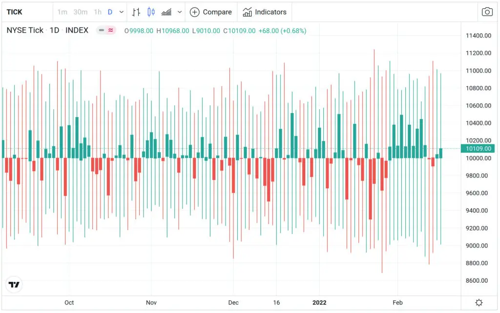
TICK is a market breadth indicator as it analyzes the upticks and downticks of each security, which short-term day traders often use. While helpful in understanding the general market sentiment, ticks fail to account for how upticks or downticks occur.
Tick Charts vs. Time-Based Charts
The best way to evaluate tick data is with a tick chart. Both tick charts and time-based charts provide valuable information, but you may prefer one type of chart over another.
The difference between the two is the unit of measurement. The bars in tick charts consist of a set number of ticks, such as 1000. And the candles in time charts are periods, such as 15 minutes.
This may sound simple enough, but the implications of these different ways of charting data can lead to very different results. To see why this is, we’ll compare time-based and tick-based charts.
See the SPY minute time chart in white and the tick chart in black:
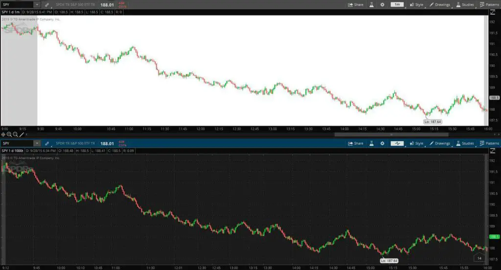
Tick-Based Charts
You’ll notice a significant difference when comparing a time-based chart and a tick-based chart because time-based charts have a consistent x-axis while tick-based charts do not.
Like time-based charts, tick charts measure the price of a security over some time but do so differently, while each new bar on the tick chart occurs after a certain number of trades occur.
Short-term traders gravitate towards tick charts, while longer-term traders use time-based charts.
Time-Based Candlestick Charts
Time-based charts are more popular than tick charts, with candlestick charts being the most popular type of price chart.
The term “candlestick” comes from the candlestick shape formed by each period of data on this type of chart. The “body” of each candlestick shows the open and close for the price of the stock for each period, and the “wicks” (the lines extending out from the bodies of the candles) are the highs and lows the price reached during that trading period.
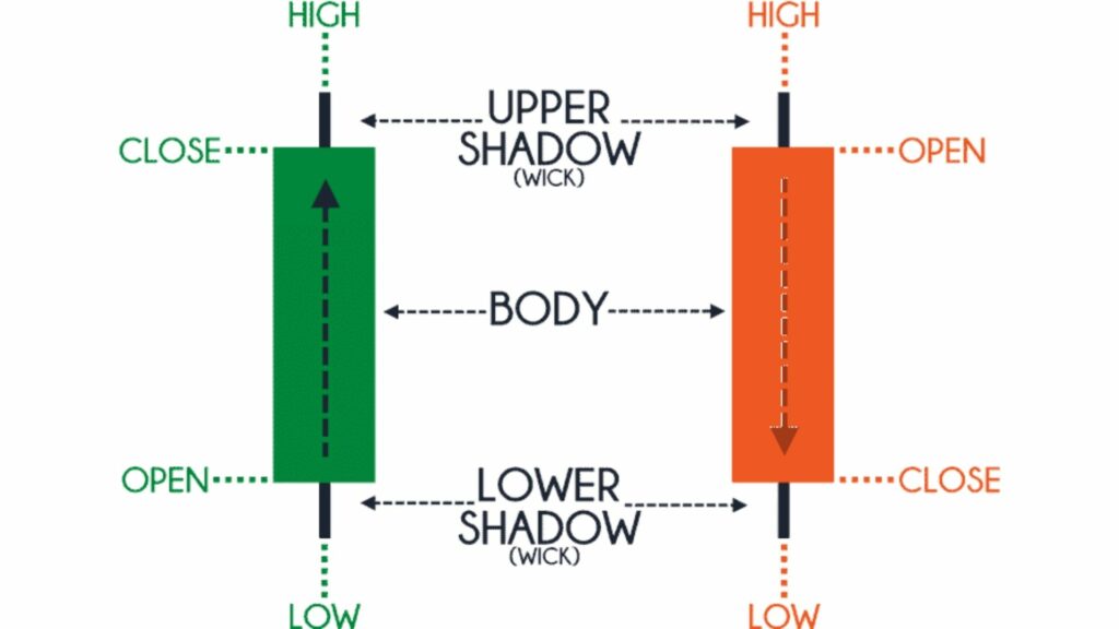
The candlesticks often are painted green to signify days where the close is higher than the open and red when the price ticks down.
One of the benefits of time-based charts is adjusting your period for multiple timeframe analyses such as the weekly, daily, and hourly periods.
The Benefits of Tick Charts
When a lot of trading activity occurs, a tick chart can provide more information than a time-based chart. Some areas where traders may find more information about trading on a tick chart include price moves on a smaller scale and consolidations.
For example, you’re comparing a tick chart and a one-minute chart (where the period is one minute). As the market opens, there may be a few different price swings in quick succession. Each of these price swings provides valuable information that may inform trading decisions later in the day.
If these price swings were all to occur in the first minute or two, even a one-minute time chart would not provide enough information for traders to see these swings happening. If you were using a tick chart to chart this first minute or two of trading, several bars would show you information that the time chart omitted. This knowledge can help with making more informed intraday trading decisions.
The additional information tick charts may show provides traders with a few key advantages.
We’ll quickly look at a few of these.
Highlights the Movements of Institutional Investors
Tick charts indicate when institutional investors are conducting trading and when small firms or individual traders are transacting. Why does this matter?
Institutional investors are professional investors who manage a large amount of pooled capital. Institutional investors determine the price of securities. Understanding institutional investor activities can help identify the best trade entry levels.
Highlights the Movements of Amateur Investors
The flip side of viewing institutional investors’ trades is viewing amateur traders’ transactions, which may also be advantageous if you use the information wisely — think of false breakouts and less-effective support and resistance levels.
Allows You to React to Trends More Quickly
Another advantage of tick charts is that they often allow you to identify trends more quickly. For those involved in day trading, minutes, and even seconds, may matter. The sooner you can identify a trend, the sooner you can place a trade.
For example, breakouts often happen pretty quickly. Identifying a breakout sooner means you can purchase shares of that stock more rapidly and at a better price.
Clarifies Cyclical Data
Trends are cyclical. Whether you look at data over years, days, or minutes, you’ll find cyclical patterns. This is the foundation of Dow Theory. Visualizing movements on a time-based chart may prove easier when it comes to trends over more extended time frames.
But when looking at trends over minutes, which is what many day traders do, time-based charts often fail to indicate these trends. The above example in which we compare a one-minute time-based chart and a tick chart in the first few minutes of the trading day is an excellent example of this concept.
Compresses Lower Activity Time Periods
Most stocks have periods when trading activity is lower. For example, you may see a dip in trading activity during lunchtime. After-hours trading and overnight trading may also have lower levels of trading activity. Time-based charts may cause you to overvalue the impact of trading in these hours. Tick charts compress the data from periods of low trading activity. Tick charts are less likely to show false breakouts or other misleading trend data in many circumstances.
Disadvantages of Tick Charts
While tick charts certainly may provide traders with some valuable information, they’re not without their weaknesses.
The biggest concern with tick charts occurs during low-volume periods.
For example, you have a 100-tick chart (a chart that places one bar for every time 100 transactions occur) and a one-minute, time-based chart tracking a stock. There is more trading activity on this stock during the beginning and end of the day, but there are only ten transactions each minute during the middle of the day.
The one-minute chart would show ten bars of information, but the 100-tick char would have only one bar making it harder to understand the price action.
While tick charts may not be ideal in all situations, like all trading tools, it’s about figuring out the best tool for each circumstance. If you’re a day trader charting a stock with low trade activity, a one-minute chart may provide more insights, while a stock with high trade activity levels may be easier to track with a tick chart.
The Bottom Line
Ticks are the smallest unit an asset’s price can move in the local currency. Tick charts prove another way for traders to visualize and interpret data. Whether or not you prefer tick charts or time-based charts, understanding both strengths and weaknesses can help you make more informed trading decisions.